Tag Archive: fonts


Quick Tip: 2 for 1 Fonts + Core Fonts

Increase your internal(mind) font library by studying one other font when adding a new font to your computer.

Two for the price of 1 helps increase your font knowledge and builds your design capabilities. The more fonts you know, the less time searching through font catalogs. You will have more confidence in your design by being more familiar with your font selection.

CORE FONTS . . .
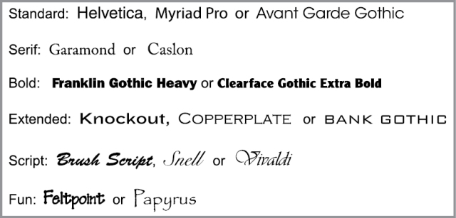
Define a core set of font styles (4 or 5 distinct styles) that you can use at will so you have less pressure when designing a quick project. You can pull these out of your back pocket and put them to good use at the time you need them.

Here’s my core fonts:

TM Core Fonts

Keep your core fonts handy, you will need them . . . !

TLM

Design Tip: Fonts . . . less is more!

5 different fonts in your page layout, I think not.
Try to keep your publication focused and consistent by utilizing no more than 3 different fonts styles.
Try 1 font style that has a wide range of weight options like Futura, Garamond or Zurich and ask yourself do I really need another style to support my theme/message.

Take a look at what Zurich has to offer . . .

The amount of combination’s within 1 font style should cover about 95% of your font needs. You just need to add one more complementary font for emphasis.

Don’t confuse the reader by “font jumping” – keep your layout consistent by keeping the font style consistent. Wild and crazy fonts running across your page makes the reader loose interest by making it difficult to navigate through all the confusing and conflicting font styles. The main points in your publication could be lost in the font jungle because your page design is not organized to lead them through the content. Consistent and complementary font styles are a way to direct your readers attention from one element to the other, and with a well organized page layout, the path way is clear and understandable to your audience.

The body text vs heading should be the same or complementary to each other. Opposites do not always attract . . . or are beneficial.
Make your different font be the one to define a special message or make a contrasting point to your story. If it’s different, it should be used as a special design element to point out an important content element since the reader’s eye is naturally drawn to the different font style out of curiosity.

Utilize all your design tools and experience within your page design, but keep the font styles down to a minimum to achieve maximum readability.

TLM

TLM Design Quick Tips

TLMdesign Blog – Quick Tips

Turn the page upside down to see what your mind is overlooking . . .

The upside down check can help you avoid small mistakes that can be easily fixed before submitting your work.

Your mind is trained to focus in on patterns and words but the problems of your composition can get hidden in the background.
The layout alignment and structure take a backseat after you have been working on the same page for a long period, or under pressure to finish.
Your mind is reading the words and is being influenced by the colors, fonts and images thinking that everything looks great.
Don’t be fooled. The structure problems of your composition will be easier to identify once your mind is not reading or being dazzled by your amazing graphics.

DESIGN TIP: Print your page and turn the printed page upside down to check the composition and flow of the layout.
Look up & down the page closely, side to side and top and bottom. You might find small alignment problems and spacing issues that were not know before.

Check and recheck, then turn off your mind and see what you are missing.

TLM